A rose trio is the next blossom subject for me in watercolor. The question is, can I realistically render three different colored roses?
 After rendering a “Sharon” rose, I felt inspired. The next morning I did a search and rescue mission for photographic images to work with on my computer and phone. Finding 3 separate pictures that I liked from my garden last year, I sketched a layout for them and here we go. A multi-colored one, a white, and one yellow blossom. You can see from the image above how I begin by applying a dark wash to where I see the shadows on each of the petal surfaces. Then, I can add some of the gorgeous colors, layer after layer.
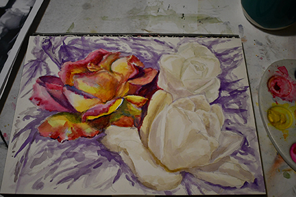
The multi-colored one on the top left gets yellow, then Opera Pink, some alizarine crimson, and darkened more with dioxin purple. Purple also shows me where shadows are darkest in the background.

The white is a long-lasting blossom named, “Abraham Lincoln”. Each Presidential petal base has a slight touch of tan shade at the base. A tiny touch of Azo yellow is added to show this subtle color change. The yellow rose is brought to life with more yellow and small touches of burnt amber.
 The yellow beauty in the front is from my spice garden. It may have survived the fire, but we won’t know until things warm up in spring. The name tag for the yellow rose is long gone. I darken the background using blues, greens, and splashes of alizaron crimson with purple.

The colors used as a background are purposely not boring and rendered in a fun wet-on-wet texture. I only want to hint at the dense foliage behind. Remember that, roses are one thing that always brings joy. If I am holding them, smelling them, looking at them in person, or painting/drawing them there is most likely a smile on my face.

 Yellow Rose 03 Tutorial. Applying a green shadow line along where the lower flower petals separate from the vertical standing petals is gently softened by adding a small amount of clean water below the line. I can also use a paper towel to dry my brush and then pick up any excess amounts of pigment before it dries. A very adjustable feathering procedure.
 This image shows how much the colors fade as they dry. It really is okay to use a lot more pigment than you would normally feel comfortable with.
 A lot more of the darkest shadows and brightest highlights have been rendered here in the blossom and on the foliage. See the completed art anytime at the
  Yellow Rose 02 Tutorial. I can turn to fill in the background areas after the flower and foliage are sufficiently defined. Using a weak solution of alizarin crimson I selectively create different areas of wet. Then I can carefully place drops of heavier concentrations of color into these wet areas. A large drop of crimson travels through a lake entertaining the eye as it spreads where ever it wants to. The watercolor seems to have a mind of its own. My darkening drops begin with accentuating the outside borders and are mostly made using alizarin crimson.
 At this point, I alternate between adding drops of purple, with bright and thick drops of cadmium red. It is scary to put this much color and allow it to spread on its own but honestly, the color pales a great deal as it dries. Being bold is good! I love the way that these brilliant colors make their own gradual nuances.
 Yellow Rose 01 Tutorial. When your garden provides the perfect yellow rose, you just have to paint it. This photograph captured all of the curving surfaces so well that I could not resist.
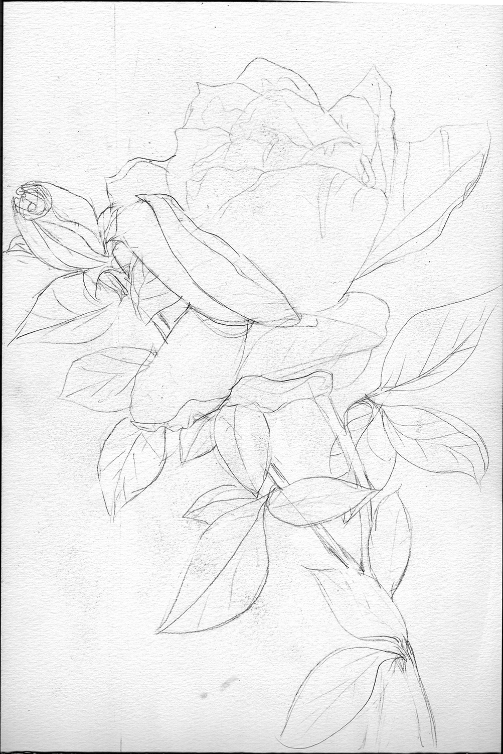
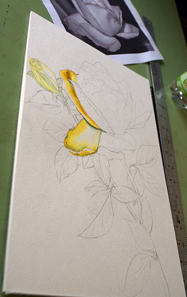
 As more of the petals are given their yellow base washes I begin to see the magic of three-dimensional illusion begin to appear. Flowers are so very amazing with the way they curve every which way showing light hitting their surfaces in ever-changing values.


 With this beautiful yellow rose sketch, I carefully recreated the petals from the photograph and then lay it out on the table right next to where I begin to paint. I also have the actual flower in front of me as I begin to paint so I can get the colors right but the first part is usually dark areas taken from the dark values in the B&W print. My goal is to get the soft light to yellow fading (wet on wet) on each petal surface first and then add in shadow.
 I am not going to use mastic to reserve the whites, instead, I plan to be careful to reserve the light areas of the paper. These first three images show the desk setup with the reference materials, paint pallet with brushes. Working on the first three petals establishes which colors seem to work best. After wetting the petal area, I fill my brush with Aureolin Yellow and drag along the darker edge to the center leaving a puddle of color at the center, this one lets other colors wash over it. Using a darker orange-yellow named, New Gamboge, to drop in color where more brilliance in the yellow is desired.